What is a high-end accent wall mistake?
In luxury real estate, an accent wall mistake refers to an architectural error, such as improper scale, incorrect paint sheen, or poor lighting alignment, that disrupts a home’s visual flow. In premium markets like Toronto’s Rosedale, Yorkville, and Forest Hill, these design flaws decrease perceived property value and extend days on the market. While a bad paint job alone will not cost you $300,000, it signals to buyers that the home requires immediate cosmetic remediation. Combined with poor staging, this “work-in-progress” perception routinely triggers 5% to 8% price reductions, costing sellers upwards of $320,000 on a $4M listing.
Key Takeaways: High-End Accent Wall Optimization
- Scale and Proportion: Painting the longest wall in a rectangular room creates a claustrophobic “tunnel vision” effect that shrinks perceived square footage.
- Lighting Physics: High-contrast accent walls placed next to floor-to-ceiling windows create glare and visually shrink the size of the windows.
- Paint Finishes: Utilizing satin or eggshell finishes behind media walls causes specular reflection, bouncing light into the viewer’s eyes and ruining the aesthetic.
- Colour Temperature: North-facing Canadian homes require warm-toned paints to counteract the 6500K blue daylight of winter.
- Design Restraint: Luxury staging relies on the 60-30-10 rule; multiple accent walls create visual chaos that deters high-net-worth buyers.
SHORT ANSWER: 7 Mistakes and Pro Fixes
In the competitive 2026 Toronto housing market, buyers are highly selective. Unprofessional paint jobs are treated as architectural liabilities. Here is a quick reference guide to the most common accent wall mistakes and how professionals fix them.
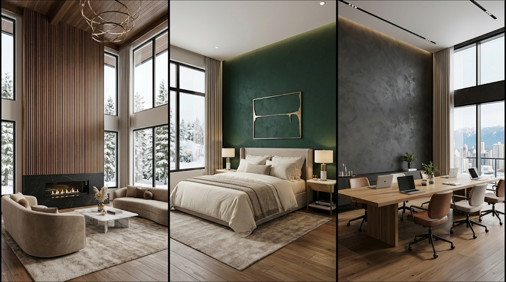
Mistake #1: Longest wall in rectangular great rooms
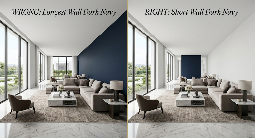
When dealing with sprawling, rectangular great rooms common in modern custom builds, homeowners instinctively gravitate toward the longest wall because it offers the largest canvas. In luxury architecture, this is a critical error.
Why does painting the longest wall create tunnel vision?
Dark colours carry heavy visual weight and naturally advance toward the human eye. When you paint the longest parallel walls of a rectangular room, you trigger an optical illusion known as “tunnel vision.” The room immediately feels narrower, resembling a luxury bowling alley rather than a grand entertaining space.
Buyers walking into this environment will subconsciously feel cramped, instantly devaluing your home’s square footage. To fix this, always accent the shortest “end” wall of a rectangular room. By darkening the far wall, the visual weight pulls that boundary forward, tricking the brain into perceiving the room as wider and more symmetrically balanced.
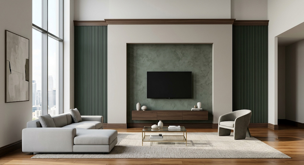
Mistake #2: Window walls in corner-unit penthouses
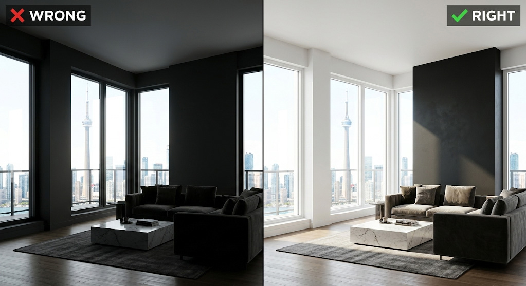
Yorkville and King West penthouses command a premium for their floor-to-ceiling glass and panoramic city views. Yet, sellers consistently make the mistake of painting the structural pillars or the drywall immediately surrounding these windows in dark, heavy accent colours.
How does high contrast affect window perception?
This violates basic glare physics. The human eye struggles to process extreme contrast. When bright, natural daylight pours in next to a dark painted surface, it creates a “silhouette effect.” The dark paint absorbs the interior light, making the wall look like a black void. Consequently, the extreme contrast actually makes the expensive floor-to-ceiling windows appear smaller.
Leave window walls in high-end condos painted in crisp, light-reflecting neutrals (like Benjamin Moore Chantilly Lace). Move your accent colour to the solid, perpendicular wall. This allows the natural light to gently wash over the accent colour without creating ocular strain.
Mistake #3: Cool greys in north-facing Rosedale libraries
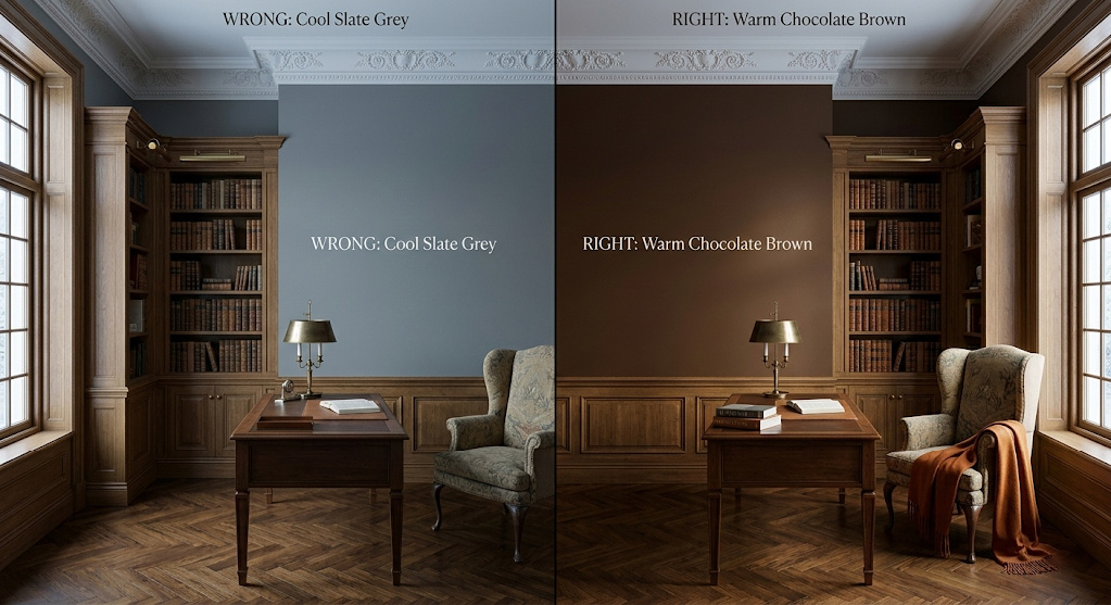
If you have painted a room and it feels completely lifeless, you are experiencing the realities of Canadian solar geometry. One of the most obvious signs your accent wall colour choice was a mistake is when a deep, sophisticated grey looks like wet cement on the wall.
How does Canadian winter light impact paint colour?
North-facing rooms in Toronto receive indirect, cool daylight that sits high on the Kelvin scale (often above 6500K). This light casts a blueish-grey hue over everything it touches. If you apply a cool-toned accent paint, like a slate grey or a chilly blue, in a north-facing Rosedale heritage home, the cold light amplifies the cold paint.
You must fight cool light with warm pigments. For north-facing libraries and studies, specify rich, warm-undertone colours. Think deep chocolate browns, earthy terracottas, or warm forest greens. These tones absorb the blue daylight and radiate warmth back into the room.
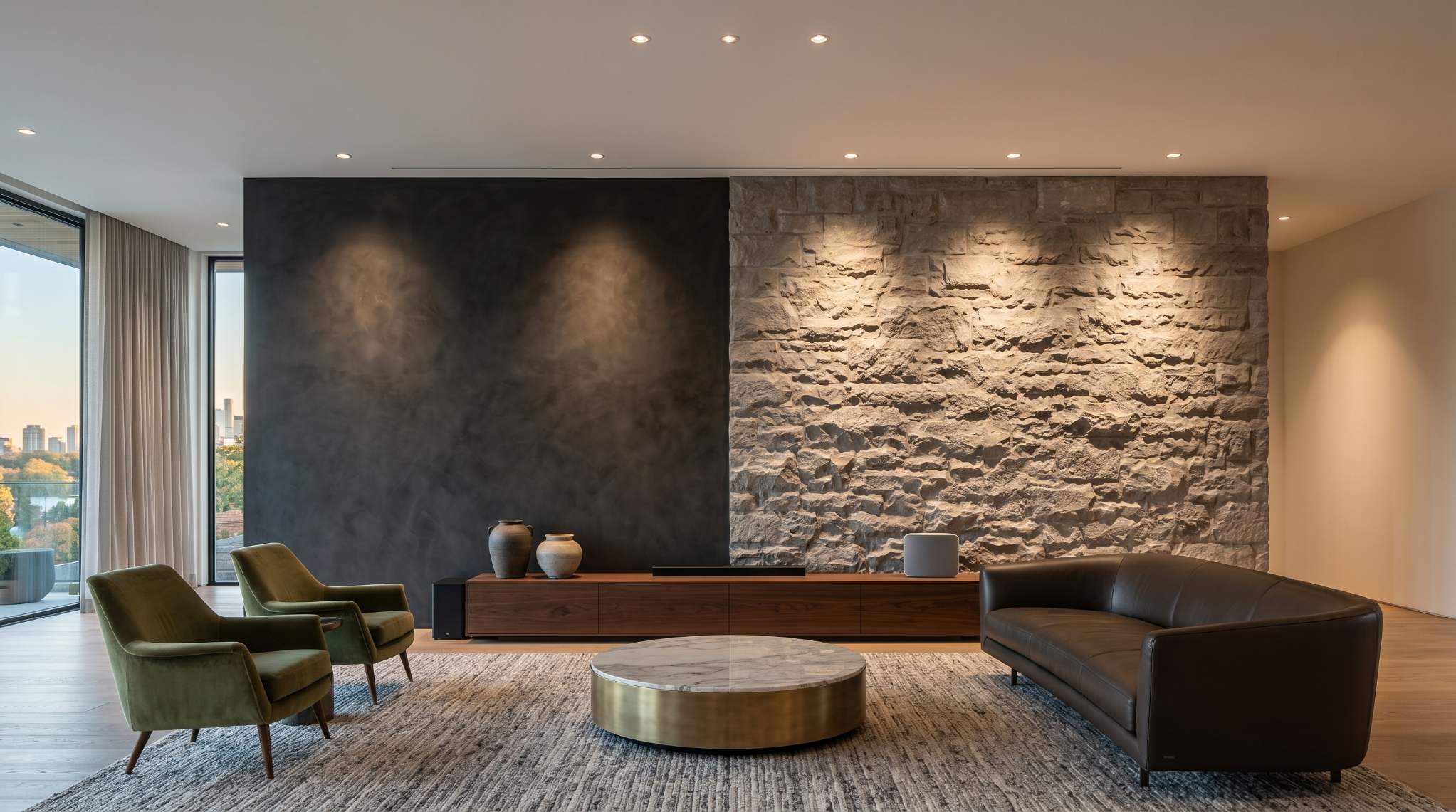
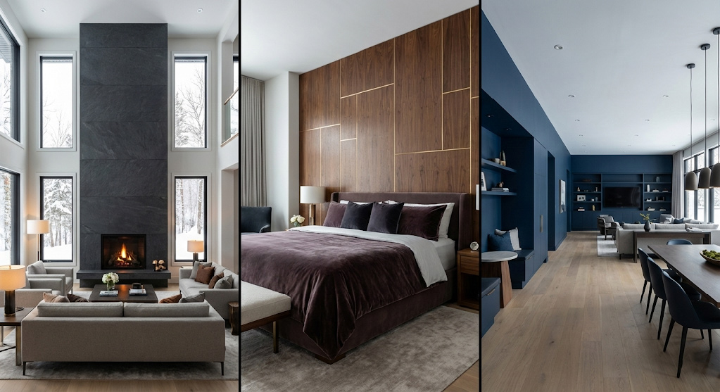
Mistake #4: Satin finishes behind $20K TVs
In dedicated media rooms or basement home theatres of $5M+ properties, the wall behind the screen is the natural focal point. A dark accent wall here is a brilliant architectural move to camouflage the television when it is turned off. However, the execution often fails due to the wrong paint sheen.
What is the best paint finish for luxury media walls?
Using an eggshell, satin, or semi-gloss finish behind a television is a nightmare for glare physics. These finishes feature high specular reflection. When your luxury buyer sits down, the wall will aggressively reflect the glare from recessed ceiling lights and the $20K OLED TV itself.
Finish Comparison: Matte vs. Satin for Media Walls
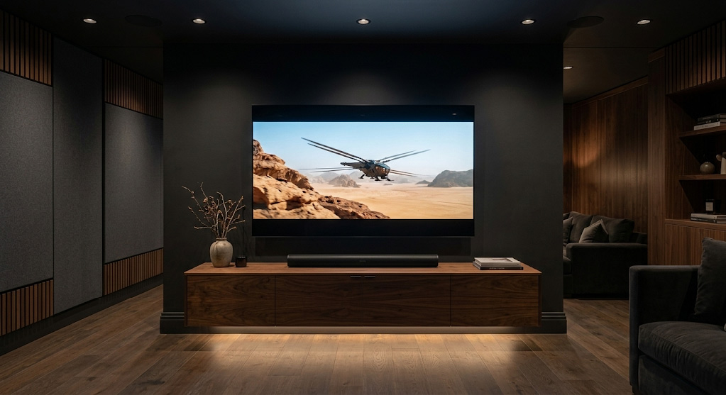
Luxury interior design demands ultra-matte finishes for media walls. You must specify a “dead-flat” paint with a maximum of 2% sheen (such as Farrow & Ball’s Estate Emulsion or Benjamin Moore’s Aura Matte).
Mistake #5: Kitchen dividers in open-concept Etobicoke estates
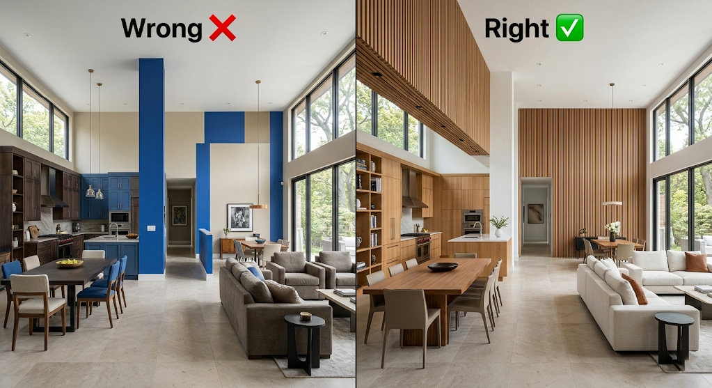
Modern luxury buyers in Toronto demand seamless open-concept living. Yet, when preparing to sell, owners of massive Etobicoke or Mississauga estates often try to “zone” their open floor plans by painting random, short divider walls, like a kitchen bulkhead, a structural pillar, or a tiny wall separating the hallway.
What is the Shared Axis Rule?
In architectural design, a wall must command physical presence to serve as an accent. Accenting a narrow structural remnant, like a 3-foot kitchen bulkhead or a hallway divider, fragments the floor plan. It draws the buyer’s eye to the structural limitations of the home rather than its vast expanse.
Unify, do not divide. Identify the “shared axis” wall, the longest, continuous structural wall that spans across the dining and living areas. Applying a premium texture or cohesive colour to this massive span stitches the zones together, emphasizing the grand scale of the property.
Mistake #6: Headboard walls with 12ft ceilings
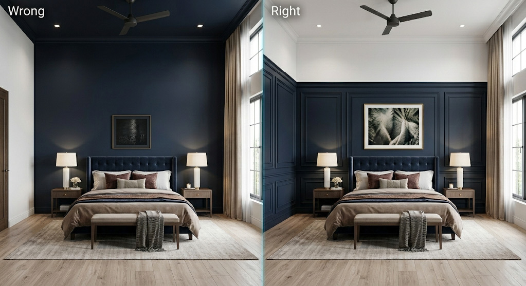
In luxury primary suites, the headboard wall is the undisputed “King Wall.” It is meant to anchor the bed and provide a sense of psychological sanctuary. However, in custom builds featuring 12ft or 14ft ceilings, simply rolling a dark coat of paint from the baseboard to the crown moulding is a disaster of proportion.
How do tall ceilings affect bedroom accent walls?
When you paint an incredibly tall wall behind a standard 5ft headboard, the vertical scale swallows the furniture. The bed appears miniature, and the top seven feet of the dark wall loom over the space. It creates an unsettling “floating” effect that diminishes the luxury appeal.
You must ground the volume. Introduce architectural millwork, such as wainscoting, applied moulding, or a picture rail, at the 8ft or 9ft mark. Apply your accent colour below this datum line to frame the bed perfectly, and paint the upper portion to match the ceiling.
Mistake #7: Multiple accent walls
The fastest way to devalue a $3M+ listing is to turn it into a funhouse of competing colours. Painting the fireplace wall navy, the kitchen island green, and the dining room niche black completely destroys the visual hierarchy of the home.
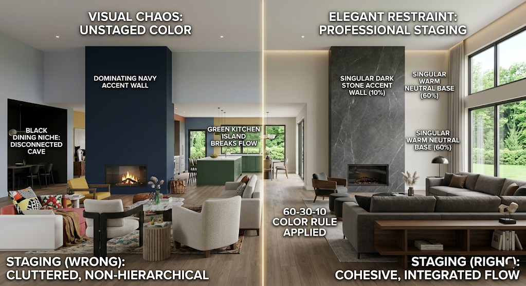
What is the 60-30-10 design rule?
Luxury interior design relies on strict ratios for visual balance:
- 60% Dominant: Neutral base colour for the majority of the walls.
- 30% Secondary: Textures, upholstery, and natural wood tones.
- 10% Accent: One defining architectural feature per floor (e.g., the grand fireplace).
When you have multiple accent walls in a single sightline, the eye has nowhere to rest. This visual chaos makes the home feel anxious. High-end buyers will walk away simply because the thought of neutralizing the entire house feels like an exhausting renovation project.
The Nuclear Option: When To Call Toronto Pros
If your property is hitting the market above the $2M threshold, you cannot afford “good enough.” The buyers touring your home are accustomed to flawless execution; they will notice a crooked cut-in line, an improper sheen, or a wall that fails to account for natural light geometry.
When millions of dollars in equity are on the line, leaving the architectural flow of your home to a standard house painter or a DIY weekend effort is a catastrophic financial risk. You require professional services for accent wall installation in Toronto that understand sightline anchoring, Light Reflectance Values (LRV), and luxury finish standards. At Accent Wall Authority, we consult directly with elite stagers and sellers to engineer walls that actively increase property valuations.
FAQ: 7 Most-Asked Seller Questions
- What are common accent wall mistakes to avoid when painting?
The most critical mistakes include painting the longest wall in a rectangular room (causing tunnel vision), using high-gloss finishes behind televisions (causing glare), and accenting narrow structural dividers in open-concept spaces. Proper placement should always follow the room’s architectural hierarchy.
- What are the signs your accent wall colour choice was a mistake?
If your room feels smaller, the paint looks muddy and flat during the daytime, or the wall draws attention to an awkward structural feature rather than a focal point like a fireplace, the colour choice and placement were incorrect for the space’s geometry and lighting.
- How to fix a bad accent wall paint job at home?
Fixing a bad paint job in luxury homes requires proper surface remediation. You cannot simply paint over dark colours. You must hire professionals to sand the wall, apply a high-hide stain-blocking primer, skim-coat texture differentials, and apply two coats of a premium 2% sheen matte finish.
- What products fix an accent wall making a room feel small?
The best products to fix an accent wall making a room feel small are high-LRV (Light Reflectance Value) ultra-matte paints. Premium lines like Benjamin Moore Aura Matte or Farrow & Ball Estate Emulsion in warm, light-reflecting neutrals push visual boundaries back without creating cheap-looking glare.
- Why does accent wall placement matter for home buyers in Toronto?
High-end Toronto buyers associate layout flow with property value. A correctly placed accent wall creates a natural focal point, anchors the furniture, and makes the floor plan feel intentional. Incorrect placement makes the home feel disjointed, signaling to the buyer that costly renovations are required.
- How does paint sheen affect home value in luxury real estate?
Paint sheen dictates how light interacts with the wall. In $2M+ homes, glossy or satin finishes on walls highlight drywall imperfections and create harsh glare, cheapening the aesthetic. Ultra-matte finishes (under 2% sheen) absorb light, hide flaws, and deliver the velvety depth expected in luxury properties.
- Where can I find professional services for accent wall installation in Toronto?
Accent Wall Authority provides elite professional services for accent wall installation in Toronto, serving Rosedale, Yorkville, Forest Hill, and the wider GTA. We specialize in luxury market preparation, ensuring your architectural features add verifiable value to your listing.
Don’t let a paint mistake destroy your negotiating power.
Audit your $2M+ listing walls before the spring rush. Contact Accent Wall Authority today for a definitive architectural assessment of your property.